

The New Japanese Eyeshadow Gradient: Elegance Parfait Couleur Palette and the Art of “Transparent Depth”
For years, the classic Japanese eyeshadow palette followed a familiar logic.
A pale colour opened the eye. A medium shade created gradation. Something darker added definition. Pearl or shimmer brought light back to the lid.
It was a beautifully controlled system—but also one with an obvious tension.
The more colour you layered, the easier it was to lose transparency.
Brown could become muddy. Pink could become heavier than expected. Deepening the outer corner sometimes meant sacrificing the clear, luminous quality that makes Japanese eye makeup so distinctive.
For its 40th anniversary, Elegance has redesigned the four-colour palette around that exact problem.
Released in Japan on August 18, 2026, the new Elegance Parfait Couleur Palette arrives in ten permanent colour stories and two limited editions. Rather than promising maximum pigmentation, Elegance describes the finish with a more unusual expression:
“透明感ディープ” — transparent depth.
Colour becomes deeper as it is layered.
But it shouldn't become cloudier.
That distinction makes Parfait Couleur much more interesting than another autumn eyeshadow launch.
Japanese Eyeshadow Has Always Been About Gradation


Japanese eye makeup has traditionally placed considerable emphasis on gradation.
Rather than treating each eyeshadow as an independent block of pigment, multiple colours are blended so that one gradually moves into another.
Light into medium.
Medium into shadow.
Shadow back into light.
The purpose isn't necessarily to make the eye makeup invisible. Japanese palettes can contain surprisingly colourful pinks, purples, greens and oranges.
What tends to remain different is how those colours interact with the complexion.
Instead of colour sitting visibly on top of the eyelid, the ideal is often for colour, shadow and luminosity to appear integrated with it.
That's why four-pan palettes have remained so useful in Japanese makeup.
Four colours are enough to create dimension without requiring a large palette—and the colour combinations have traditionally done much of the work for you.
Parfait Couleur keeps the four-pan format.
What Elegance changes is the assumption that those four colours need to be used in a fixed sequence.
“Transparent Depth” Sounds Contradictory. It Isn't.

Normally, increasing colour depth means increasing the amount of pigment visible on the skin.
And the more layers you add, the greater the risk of losing clarity.
Elegance approaches the problem partly through the base surrounding that pigment.
The powders contain high-transparency oils, allowing colours to adhere closely to the eyelid while retaining clarity as they overlap. The brand says the formula is designed to integrate with the skin, create dimension and produce gradation without muddy-looking colour.
So “transparent” doesn't mean:
barely visible.
And “deep” doesn't mean:
dark.
Here, transparency describes how clearly light can continue to interact with the layered colour.
Depth describes the dimension created as those layers accumulate.
The two can therefore coexist.
That is the basic optical idea behind Parfait Couleur.
The Palette Actually Uses Two Different Kinds of Powder
There's another piece of the formulation that explains why these aren't simply four colours pressed into the same base.
Elegance uses two different sensory types within the palettes.
MAQUIA describes one as a silk-like, moist base and the other as a cotton-like, softly fitting base. Different balances of those textures are selected according to each colour story.
That changes how the four colours behave together.
One can bring closer adhesion and smooth luminosity.
Another can introduce softer, airier colour.
Pearl, glitter and differences in intensity can then be layered over those textures.
So the palette isn't simply:
Colour A + Colour B + Colour C + Colour D.
It is closer to:
colour + texture + transparency + light.
And those four variables can be rearranged.
The Most Important Rule: There Isn't One Correct Order
This may be the biggest departure from the traditional four-pan eyeshadow mentality.
Parfait Couleur isn't designed around a universal:
A → B → C → D
application sequence.
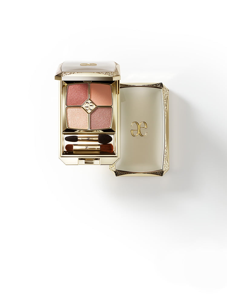
MAQUIA specifically notes that the colours can be layered in different orders while retaining a clear-looking result.
Elegance's own makeup instructions demonstrate this surprisingly well.
Take 01 Serenity Nude.
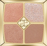
Instead of beginning with the palest colour, makeup artist Nozomi Kawashima starts with the deepest shade at the lash line and blends it upward across the eye socket.
Only afterwards are two lighter colours mixed together and layered over it.
The final luminous shade goes on last.
With 02 Euphoria Pink, the sequence changes again.
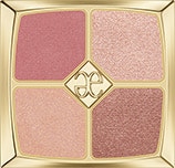
Pink establishes the eye first, brown is layered into the double-eyelid area, and two contrasting textures are distributed across the lower lid.
This is a subtle but important change in how to read the palette.
The darkest colour doesn't automatically belong at the end.
And the lightest colour doesn't automatically belong at the beginning.
Parfait Couleur is designed less like a four-step instruction sheet and more like four materials that can be rearranged.
The Japanese Trick: “Polish” Your Eyeshadow
Kawashima gives three pieces of advice for creating the transparent eye looks associated with Parfait Couleur.
One is particularly interesting:
apply the eyeshadow as though you were polishing it.
Elegance says this helps increase shine and enhances the translucent appearance of the eye area. Kawashima also recommends introducing pearl, glitter or shimmer somewhere around the eye and avoiding rigid conventional application rules when building dimension.
“Polishing” shouldn't be interpreted as aggressively rubbing the eyelid.
It's better understood as buffing a thin layer of colour smoothly across the skin, allowing the powder and its transparent oil base to integrate rather than leaving obvious deposits of pigment.
This is also why simply judging Japanese eyeshadow by a heavy finger swatch can be misleading.
Some formulas become more interesting as they're blended.
The goal isn't always maximum pigment in one pass.
Sometimes it's what happens to light after the powder has been worked into the skin.
Twelve Palettes, but Not Twelve Versions of Brown
Japanese eyeshadow still has an international reputation for beige and brown.
Parfait Couleur makes that stereotype difficult to sustain.
The permanent collection contains:
01 Serenity Nude
02 Euphoria Pink
03 Beloved Princess
04 Cozy Blanket
05 Vintage Memory
06 Peaceful Bloom
07 Majestic Suit
08 Rose Allure
09 Graceful Wind
10 Mystique Glow
The two limited anniversary colours are:
100 Eternal Heroine
101 Endless Glory.
But reading twelve palettes as twelve separate shade descriptions doesn't tell us very much.
The collection becomes more useful when you look at what Elegance is doing with colour.
Soft Structure: Nude, Beige and Grey-Brown
Start with:
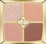
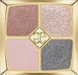
MAQUIA classifies these broadly as neutral nude, warm beige and modern greyish brown respectively.
These palettes represent one of the most recognisable strengths of Japanese eyeshadow:
creating structure without relying on obviously dark contouring.
A nude palette doesn't have to disappear.
Beige doesn't have to be flat.
And grey-brown doesn't have to become smoky.
Instead, small differences in temperature, reflection and depth can make the eyelid appear more dimensional while keeping the overall eye relatively light.
01 Serenity Nude demonstrates this particularly well.
Elegance's official technique begins with depth and then lays lighter, more luminous colour over it.
The shadow is therefore underneath the light, rather than simply placed beside it.
That is a very different way of creating dimension.
Pink Doesn't Have to Mean One Kind of Pink
Then there are:
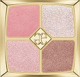
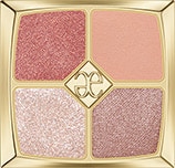
They're all in the broader pink-to-rose family, but their temperature and visual weight are quite different.
02 introduces hidden redness into a warmer pink palette.
03 moves towards a cooler pink.
08 deepens into rose, combining richer colour with brown and luminous accents.
This is where the transparency concept becomes particularly useful.
Pink can become visually heavy surprisingly quickly when several rosy, brown and pearl shades overlap.
With Parfait Couleur, the objective isn't to prevent that layering.
It's to allow the layering without losing the identity of the colours underneath.
MAQUIA's finished look for 08 Rose Allure, for example, uses matte pink, rose and champagne beige to create a much more dramatic eye while retaining visible luminosity.
The palette can therefore become deeper without automatically becoming smoky.
Orange, Green and Mauve Change the Mood
The collection becomes less conventional with:
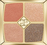
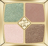
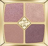
MAQUIA describes them respectively as healthy orange, brown accented with green, and elegant mauve.
These are useful examples of another Japanese approach to colour.
The unusual shade doesn't necessarily take over the entire eye.
Green can interrupt brown.
Orange can introduce warmth.
Mauve can alter the shadow.
Colour becomes part of the gradation rather than a separate statement sitting above it.
That distinction is important when looking at Japanese colourful eyeshadow.
Colourful doesn't necessarily mean colour-first.
The eye can still be built around dimension, skin integration and light.
Vintage Memory Goes Somewhere Darker
05 Vintage Memory sits in the chic brown category, but its position within this collection is worth noting.
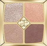
Parfait Couleur isn't rejecting depth.
It's rejecting the idea that depth must come at the expense of clarity.
Brown therefore remains an important part of the collection, especially for creating shadow and definition.
The difference is that the transparent base allows that brown to coexist with lighter textures rather than simply covering them.
This is probably the clearest way to understand Elegance's “transparent depth” concept:
transparency isn't the opposite of intensity.
It's what allows intensity to remain dimensional.
The Anniversary Palettes Turn Up the Light
The limited 100 Eternal Heroine and 101 Endless Glory sit slightly outside the everyday colour architecture of the ten permanent palettes.
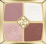
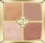
MAQUIA characterises 100 as a particularly sparkling rosé palette and 101 as a softer copper-beige combination.
That makes sense in the context of Elegance's anniversary.
The permanent shades establish the new eyeshadow system.
The limited shades make the system more celebratory.
Rather than introducing completely different formulation logic, they push sparkle and luminosity further.
And because both are limited editions, they also function as the more collectible side of the 40th-anniversary launch.
A Shade Map Is More Useful Than a Ranking
Rather than ranking twelve palettes from “best” to “worst,” the collection makes more sense as a map.
| Colour Direction | Palette | What Changes the Eye |
|---|---|---|
| Neutral Nude |
|
Soft structure and luminosity |
| Warm Pink |
|
Warmth + dimensional pink |
| Cool Pink |
|
Clear, cooler sweetness |
| Warm Beige |
|
Gentle warmth and definition |
| Chic Brown |
|
Deeper, refined shadow |
| Orange |
|
Healthy warmth |
| Greyish Brown |
|
Modern, cooler structure |
| Rose |
|
Elegant colour depth |
| Brown + Green |
|
An unexpected colour accent |
| Mauve |
|
Cooler, atmospheric depth |
| Sparkling Rosé |
|
Anniversary luminosity |
| Copper Beige |
|
Warm, soft metallic dimension |
The point isn't that one palette belongs to one specific skin tone or age group.
It's that each changes the balance between colour, shadow and light differently.
That leaves considerably more room for personal application than a conventional “best shade for you” chart.
What Japanese Beauty Editors Are Noticing
The first Japanese editorial response has focused less on pigment intensity and more on how forgiving the layering is.
VOCE editor Hikaru Oki, using shade 01, specifically praised the powder for maintaining clarity even after repeated layering while still creating visible dimension. She also highlighted how little technique is required to make the eye look structured.
MAQUIA similarly emphasises the ability to layer without muddiness, the high-transparency oil and the two different powder bases. Its broader Autumn 2026 eyeshadow guide highlights the fact that the colours can be layered in different orders while maintaining a clear-looking finish.
That's revealing.
The story Japanese beauty media is picking up isn't:
“Look how pigmented this eyeshadow is.”
It's:
“Look how much you can do before the colour becomes muddy.”
Those are two very different measures of eyeshadow performance.
Why Four Colours Still Make Sense in 2026
There was a period when eyeshadow palettes seemed to grow endlessly.
Six shades.
Ten shades.
Twelve.
Twenty.
More colours meant more possibilities.
Elegance has gone in the opposite direction for one of its major 40th-anniversary launches.
Four colours are enough.

Not because the looks need to be simple, but because each colour is designed to interact with the others.
The possibilities come from:
changing the order,
mixing shades,
altering intensity,
moving shimmer,
and layering textures.
The official techniques make this especially clear. Different palettes don't simply repeat the same four steps with different colours.
A compact four-pan palette can therefore create variety without requiring the user to decide which four shades out of fifteen actually belong together.
The curation has already happened.
The experimentation happens in the application.
Parfait Couleur Palette at a Glance

| Elegance Parfait Couleur Palette | |
|---|---|
| Product | Four-colour eyeshadow palette |
| Japan Launch | August 18, 2026 |
| Permanent Palettes | 10 |
| Limited Palettes | 2 |
| Key Finish Concept | “Transparent Depth” |
| Formula Feature | Powder containing high-transparency oil |
| Texture Design | Silk-like moist + cotton-like airy bases |
| Layering | Designed to remain clear as colours overlap |
| Application Style | Colours can be rearranged rather than following one fixed sequence |
| Anniversary | Elegance Cosmetics 40th Anniversary |
Frequently Asked Questions
What is Elegance Parfait Couleur Palette?
Elegance Parfait Couleur Palette is a new four-colour Japanese eyeshadow launched on August 18, 2026 for Elegance Cosmetics' 40th anniversary. The range includes ten permanent palettes and two limited editions.
What does “transparent depth” mean?
Elegance uses the phrase to describe eyeshadow that gains colour depth as it is layered without becoming muddy or losing its translucent appearance. The powders contain high-transparency oil and are designed to integrate closely with the eyelid.
How many Elegance Parfait Couleur Palette shades are there?
There are 12 palettes at launch: ten permanent shades numbered 01–10 and two limited shades, 100 Eternal Heroine and 101 Endless Glory.
Do I have to apply Parfait Couleur Palette in a specific order?
No. One of the distinctive features of the palette is that the colours can be layered in different sequences while maintaining clarity. Elegance's official makeup looks use different application orders depending on the palette and desired effect.
Why are there different textures inside the palette?
The collection uses two types of bases described by MAQUIA as silk-like and moist versus cotton-like and airy. Their balance changes according to the individual colour story, allowing different combinations of adhesion, softness, colour and luminosity.
What are the limited Elegance Parfait Couleur Palette shades?
The limited shades are 100 Eternal Heroine, a sparkling rosé colour story, and 101 Endless Glory, a soft copper-beige palette. Availability is limited.
How should I blend Japanese eyeshadow for a transparent finish?
Elegance makeup artist Nozomi Kawashima recommends adding pearl, glitter or shimmer somewhere around the eye, varying colour intensity instead of following rigid placement rules, and applying colour with a light “polishing” motion to increase luminosity.
The Japanese Gradient Is Becoming Less Predictable
Parfait Couleur Palette doesn't abandon the traditions that made Japanese four-pan eyeshadow so successful.
It still values gradation.
It still values integration with the skin.
And it still uses a carefully edited group of colours rather than asking the user to navigate an enormous palette.
What changes is the structure.
The old four-pan logic was easy to understand:
four colours, four roles, four steps.
Parfait Couleur loosens those boundaries.
A deep colour can go first.
Two colours can be mixed.
Shimmer can move.
A stronger colour can become part of a translucent layer rather than sitting at the edge of the eye as definition.
And because the powder is designed to remain clear as those layers accumulate, experimentation doesn't necessarily mean sacrificing Elegance's polished aesthetic.
That may be the more interesting direction for Japanese eyeshadow in 2026.
Not more pigment.
Not more colours.
Not a larger palette.
More freedom inside the gradient.
And for Elegance, a brand celebrating its 40th anniversary, Parfait Couleur feels appropriately evolutionary: it keeps the classic Japanese four-colour palette intact while quietly changing the rules for how those four colours are supposed to be used.